SIX STEP BOWLING BROCHURE
ILLUSTRATION / PRINT DESIGN
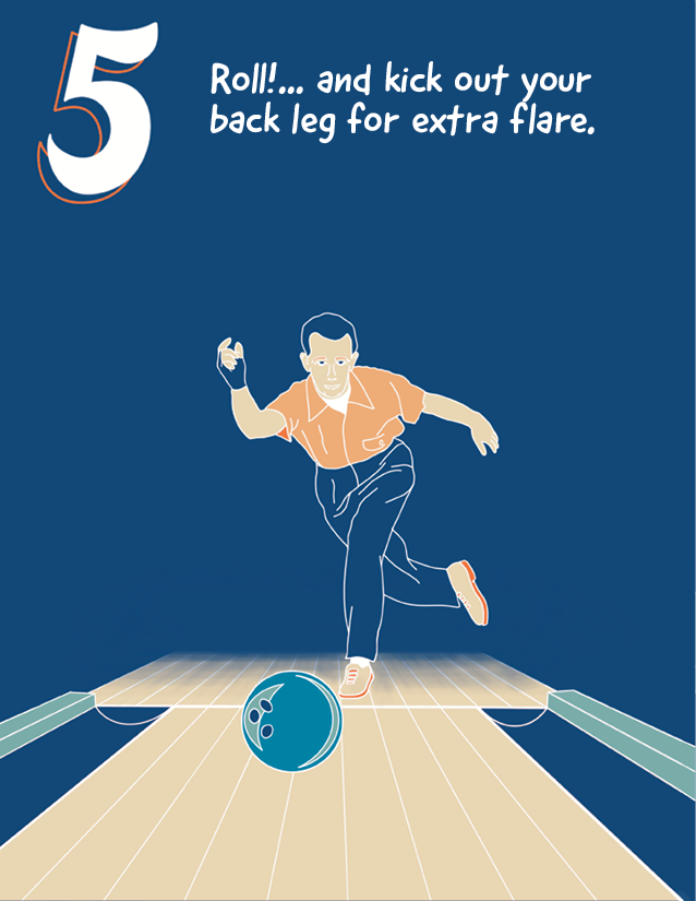
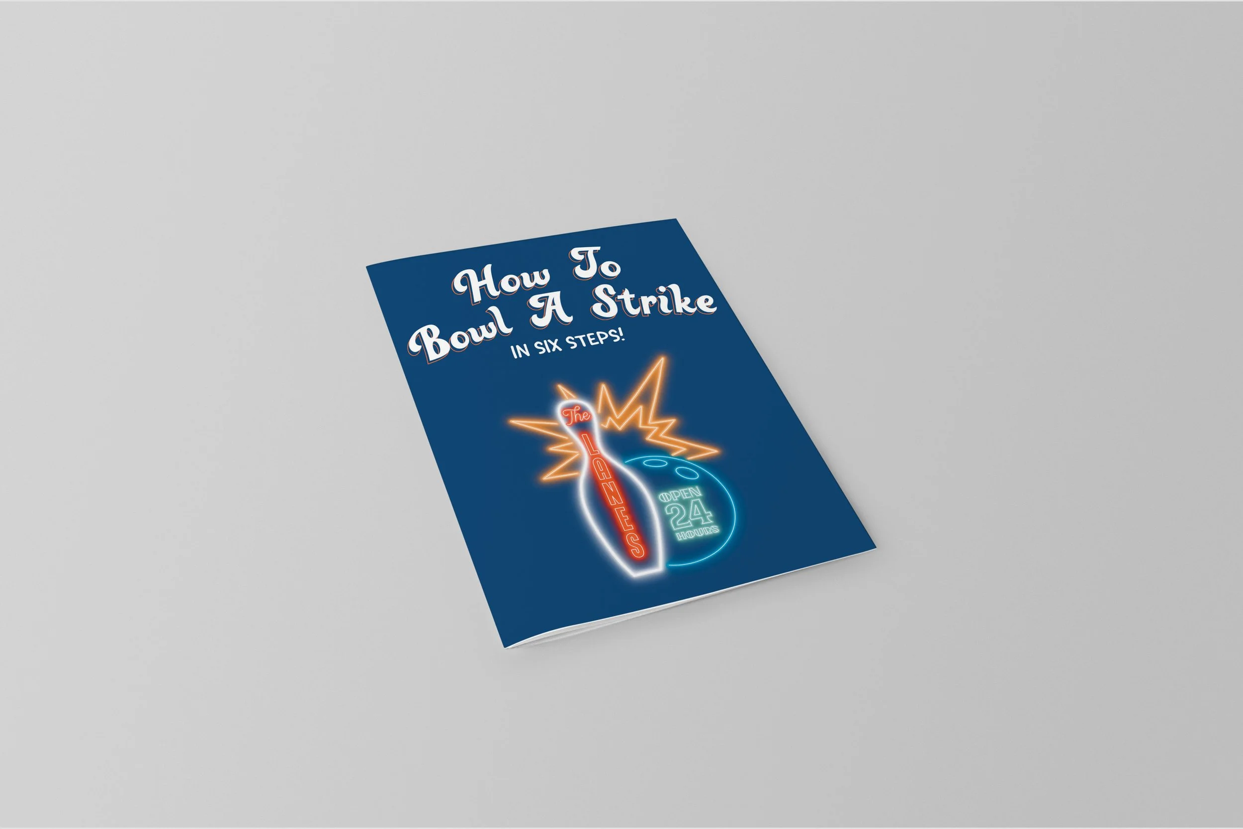
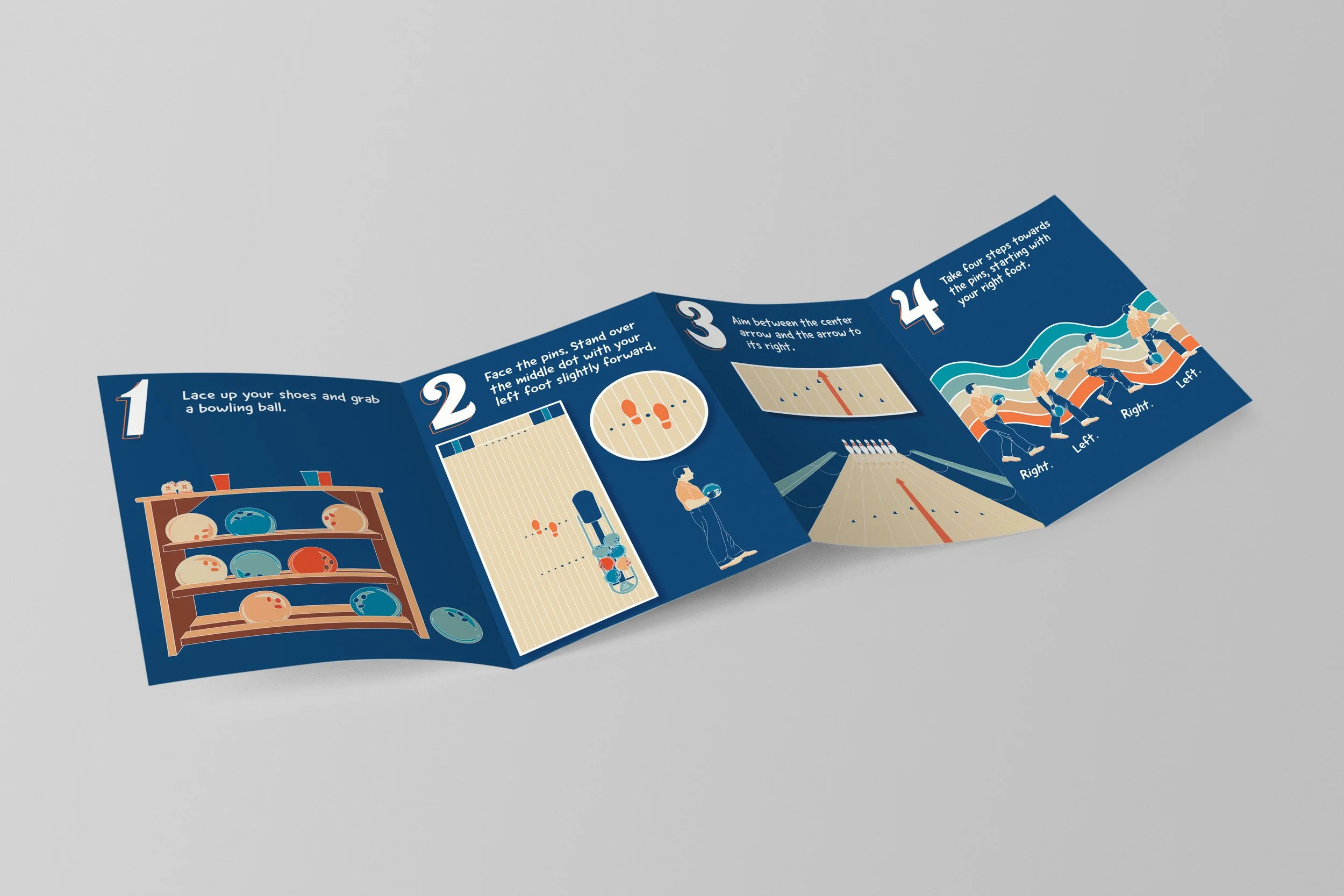
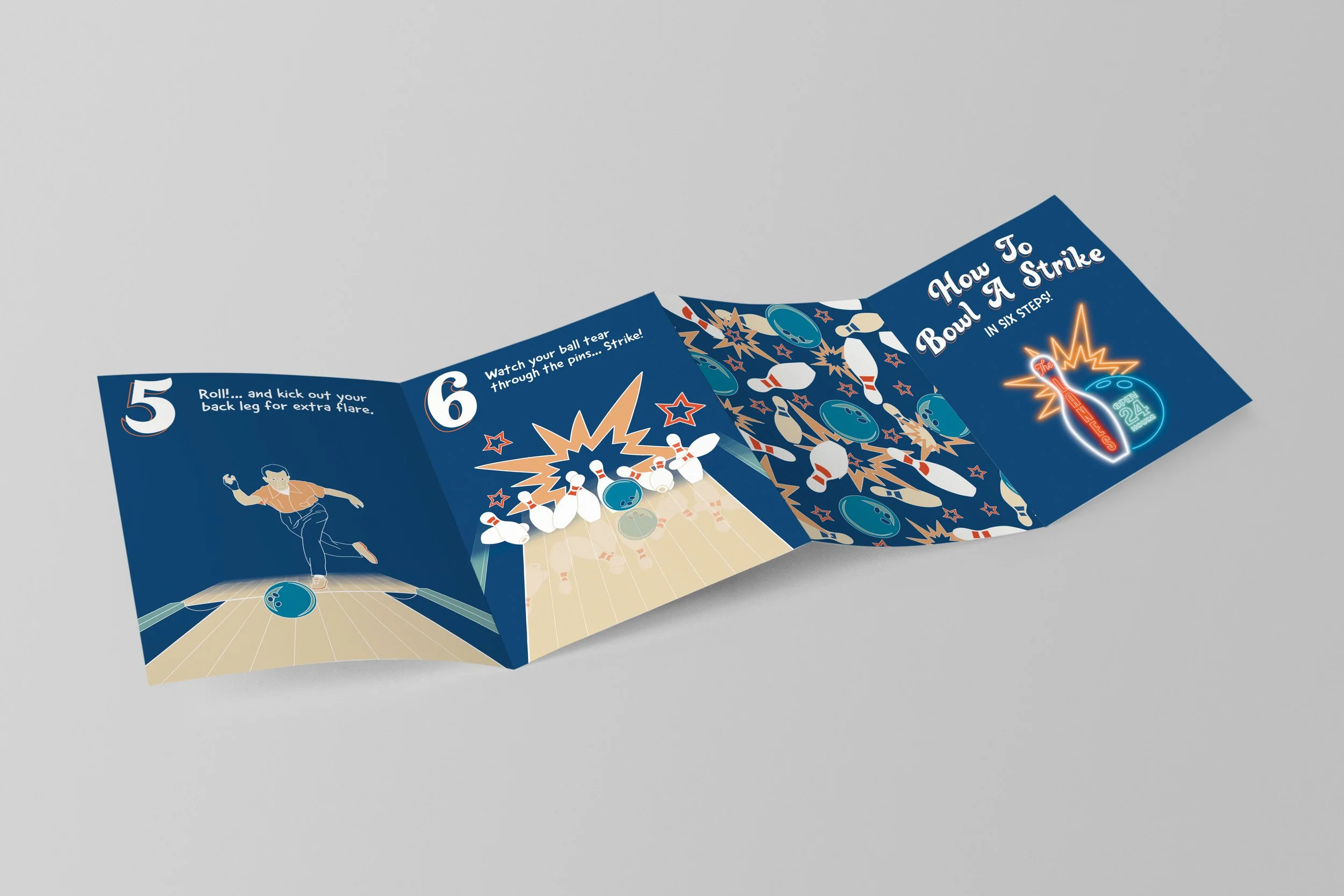
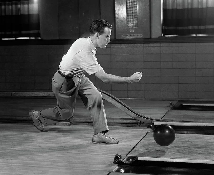
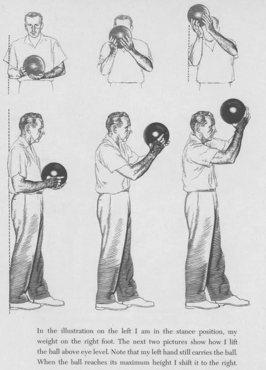
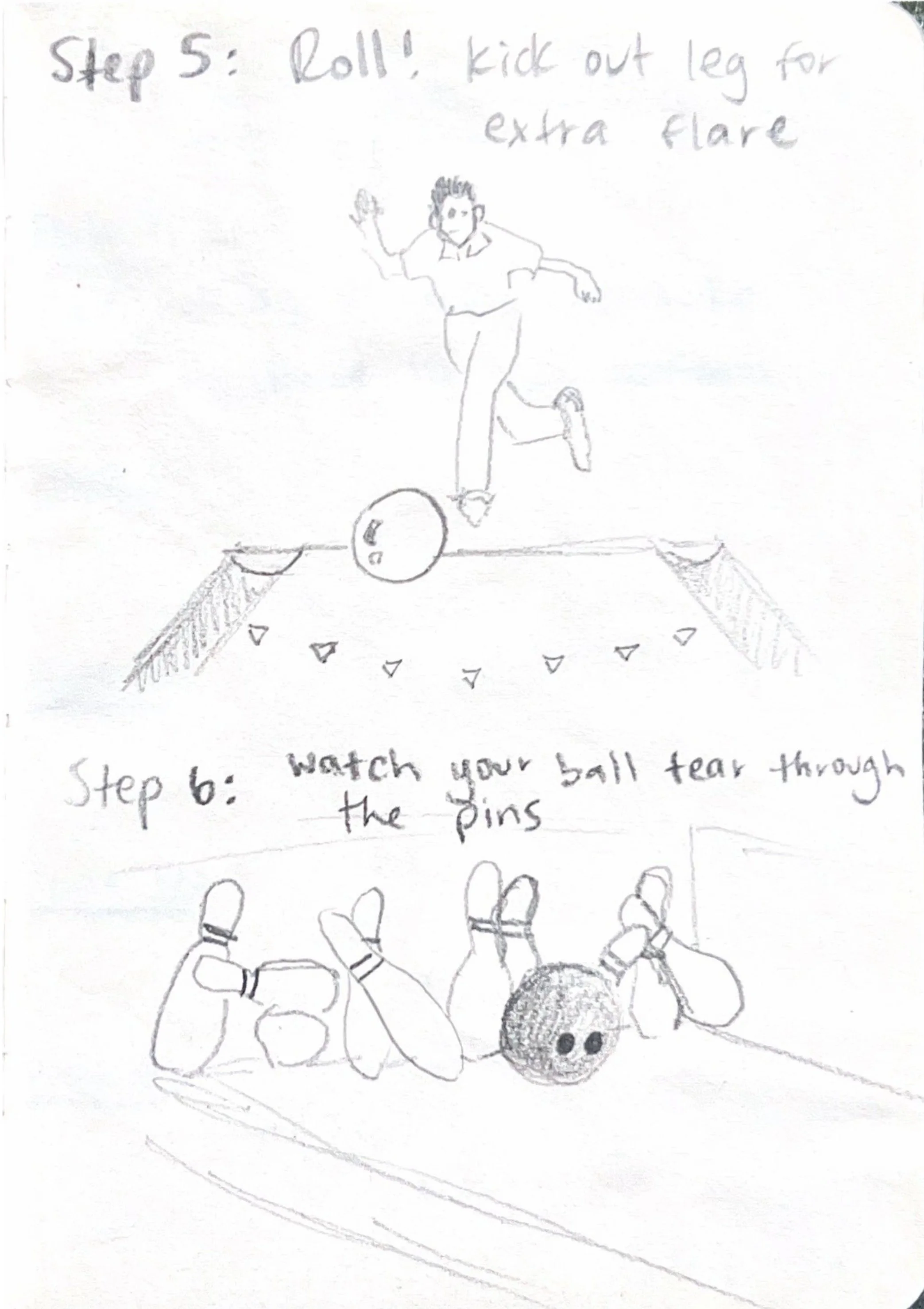
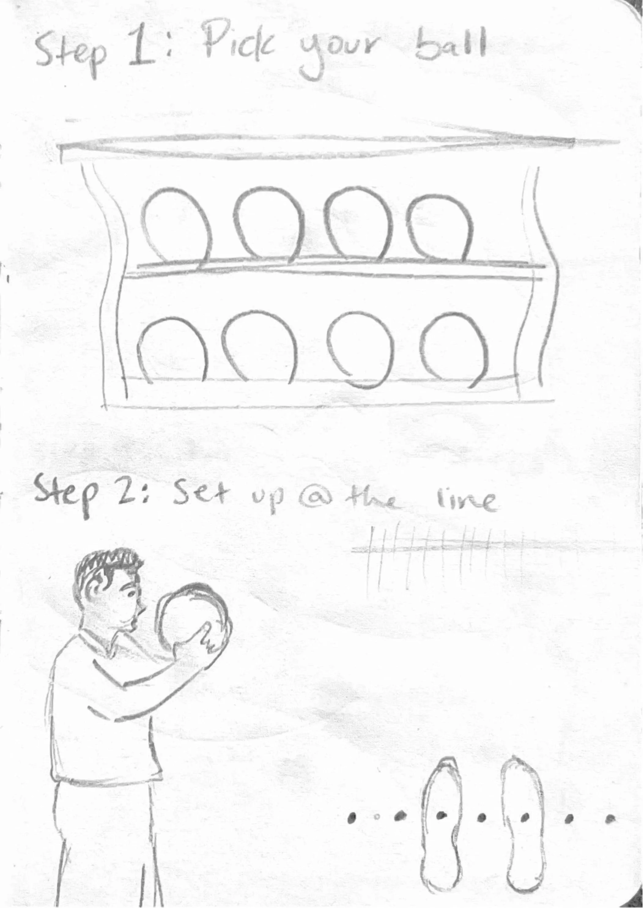
For this brochure, students were tasked with creating a sound design system to explain a task in only six steps. Taking inspiration from vintage comic strips and the 70’s aesthetic, I devised an illustration style and paired it with six concise captions in a cartoon typeface, each describing a step in the process of bowling a perfect strike. The end result is a clean, yet visually pleasing layout designed specifically for print.

REFERENCES


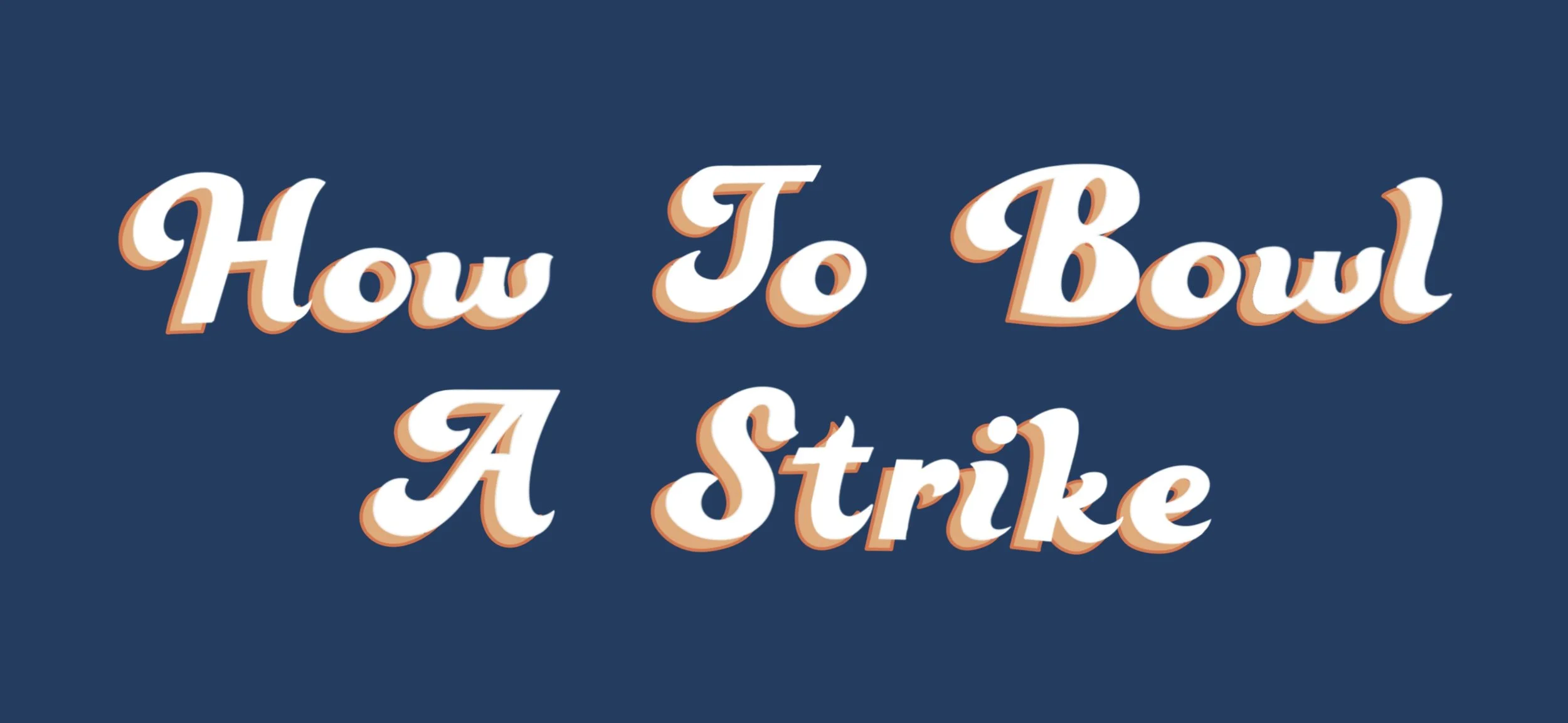
FRONT COVER ILLUSTRATION
6-STEP WIREFRAME SKETCH
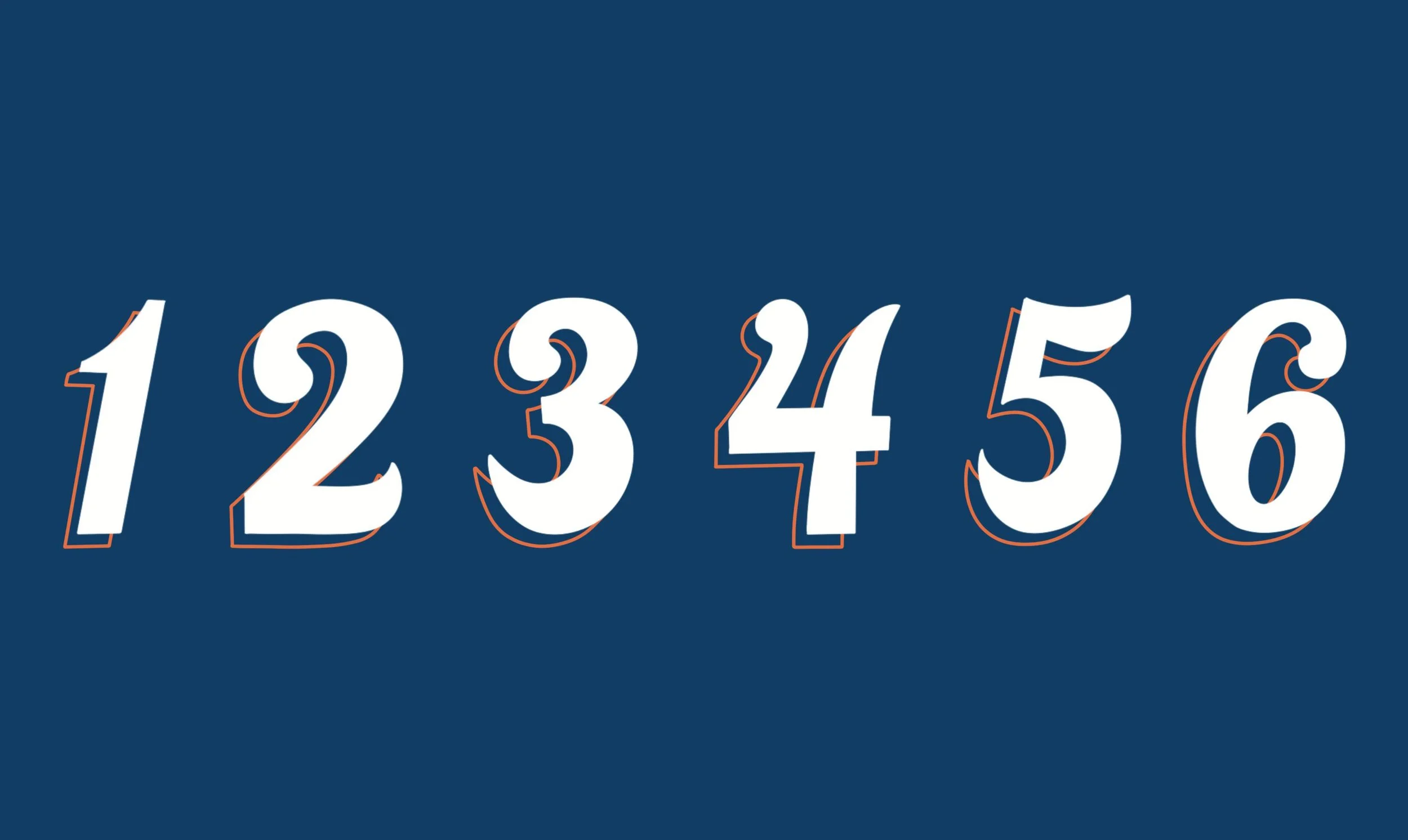
a hand-drawn serif font for the front cover using opaque colors to complement the illustration style


BACK COVER ILLUSTRATION
OTHER ILLUSTRATIONS


8-PAGE LAYOUT