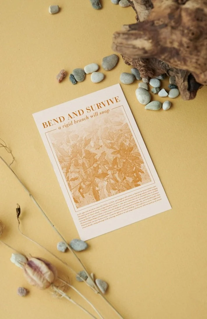
MANIFESTO POSTER SERIES
PHOTOGRAPHY / PRINT DESIGN
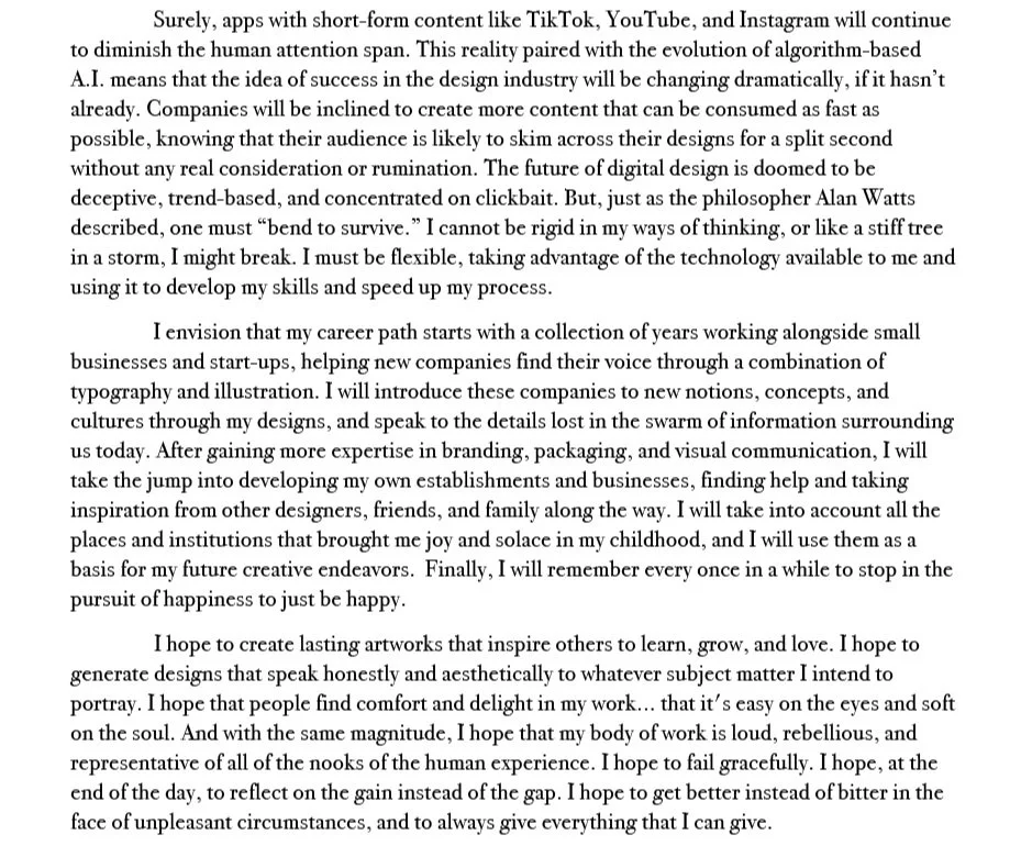
For this project, students were tasked with writing and digitally iterating a short 750 word manifesto describing our core values and intended destinations in the design world. As I inch closer to my college graduation, I’ve spent more and more time reflecting on which creative paths to take and which lifestyle choices to make. This nature-inspired, 8x10 poster series includes themes of impermanence, growth, and creative adaptation

MANIFESTO

SKETCHES
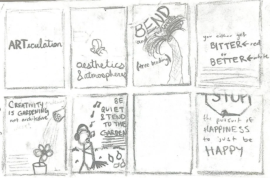

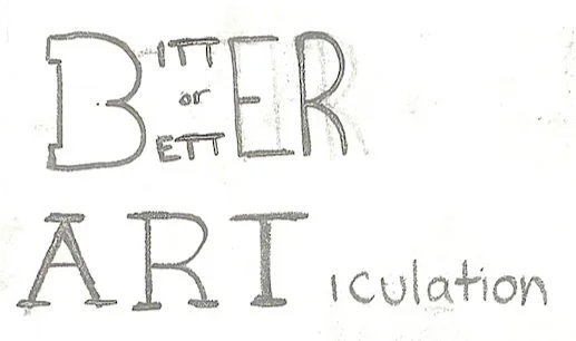
Original sketches based off in-text callouts were too illustrative and were not cohesive as a series. I needed a more typographic approach.


COLOR EXPLORATION

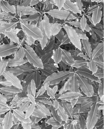

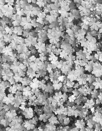
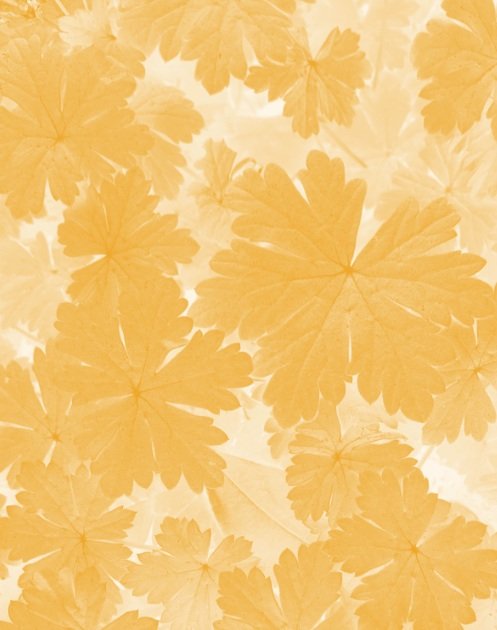
The inverted duotone effect on the photos mimics cyanotype photography.
I adopted a color palette based off leaves shifting colors over time, alluding to the impermanence and change I discuss in my writing. Each color is applied to a self-taken photograph of dense foliage, illustrating the countless roadblocks and adaptations that designers go through.


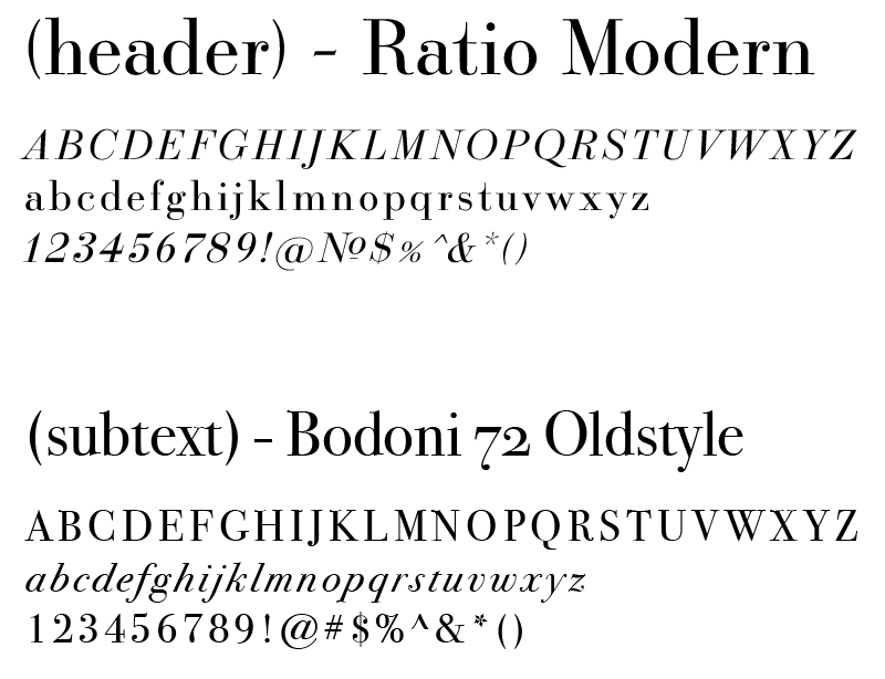
TYPEFACES

After setting the type styles, I added a gradient to each image and included some graphic elements to better blend the photography with the type.
SIX FINAL LAYOUTS