SKOLOS + WEDELL BOOKLET
PRINT DESIGN
For this project, students were tasked with turning a short article regarding designers Nancy Skolos and Thomas Wedell into a cohesive booklet. I began by creating a grid-based spread composition to use as a basis for my entire booklet. Because we were only allowed to use one font for the entire book, I had to use type styles to create hierarchy and structure. The end result is an aesthetic, yet legible booklet that pays homage to these designer’s beautiful relationship and their work.

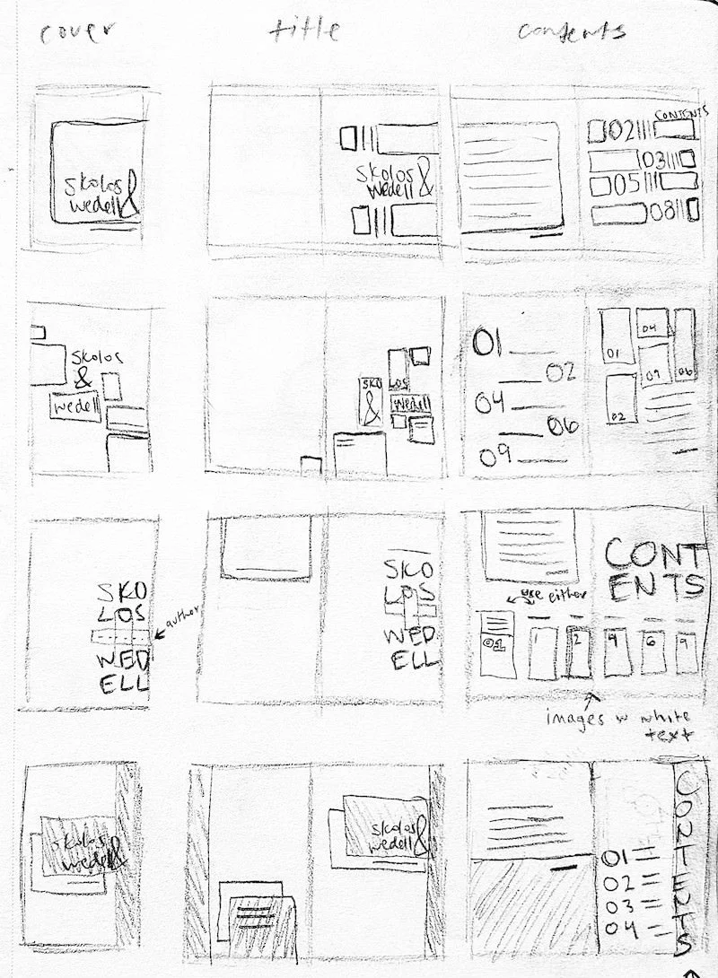
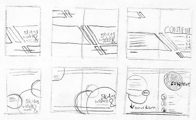
SKETCHES
I found that my most successful composition involved a series of overlapping circles, some of which would be used as placeholders to later display some of the designers’ artistic collaborations.

FIRST COMPUTER ITERATIONS

Students were limited to one font family for the entire booklet. So, I needed to create contrast and hierarchy by using various type styles, weights, point sizes, and indentations… all while maintaining legibility.
I began by setting the margins, adding placeholders for page numbers, and including four thin stroke lines to frame each page in a cohesive manner.

TYPESETTING STANDARDS
Next, I created and refined a variety of type styles to make typesetting quick and easy for the entire book.


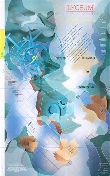
LYCEUM FELLOWSHIP, 1995
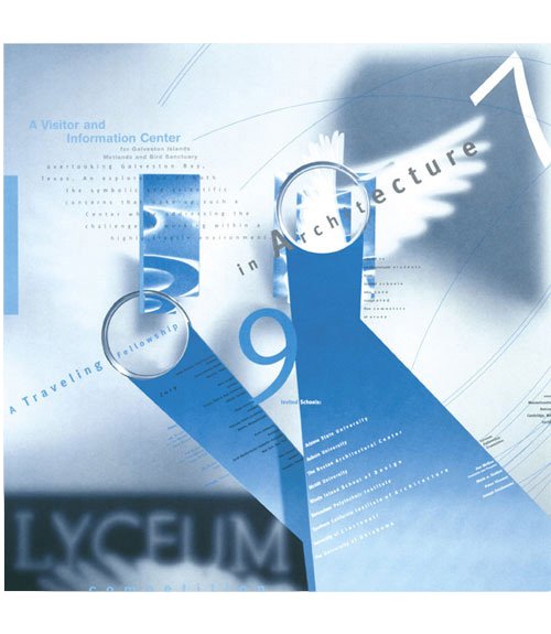
LYCEUM FELLOWSHIP, 1997
INCLUDED WORKS FROM SKOLOS + WEDELL

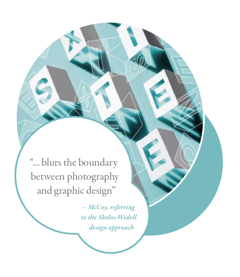
COEXISTENCE, 2015
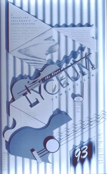
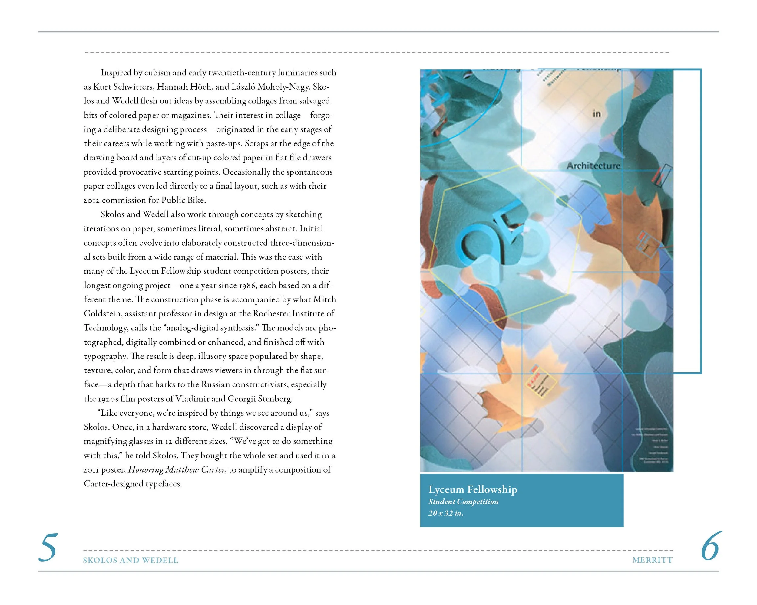
LYCEUM FELLOWSHIP, 1993
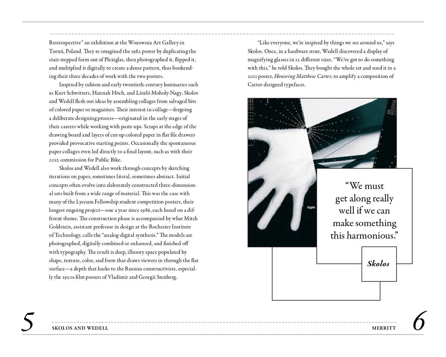
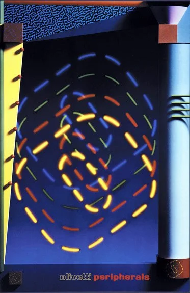
OLIVETTI, 1984
COLOR SCHEME
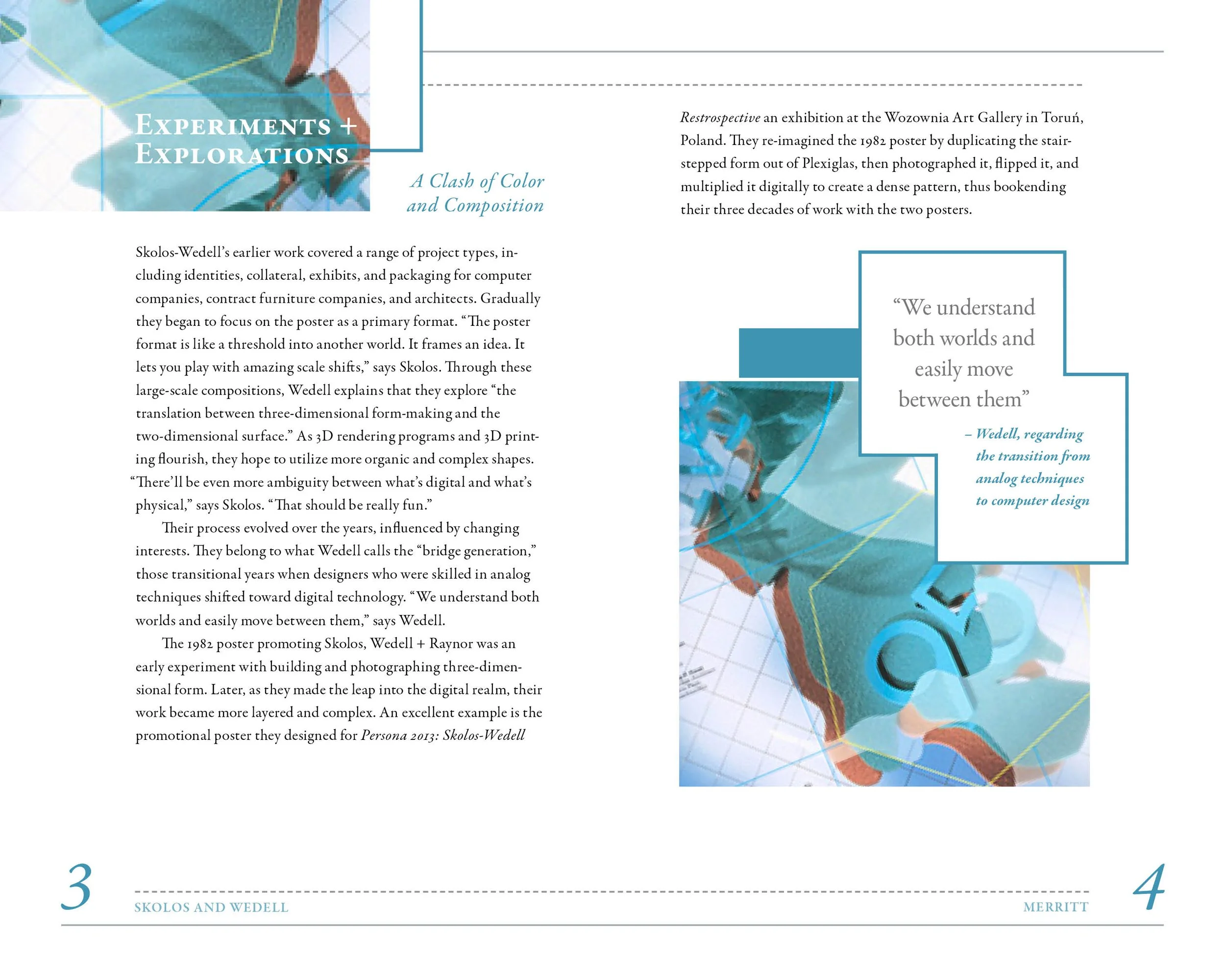
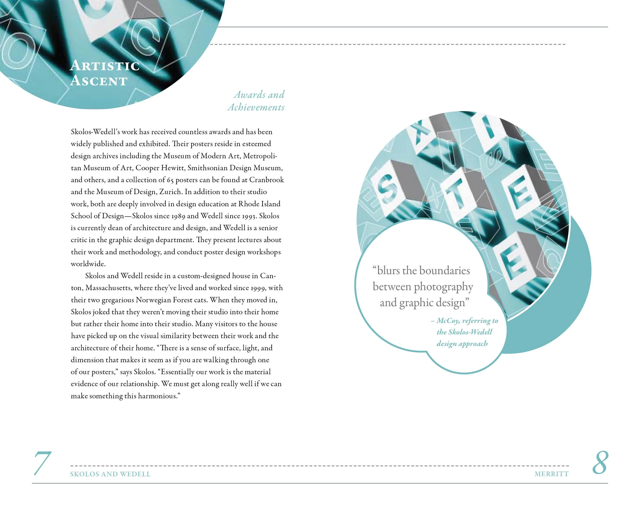
The blue/green color palette is eye-dropped from each of Skolos and Wedell’s incredible graphic works.
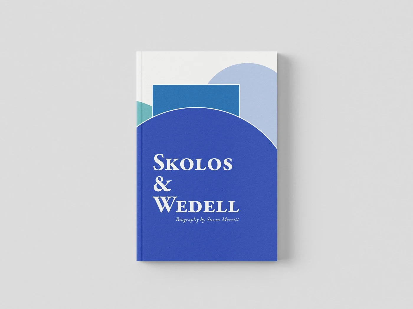
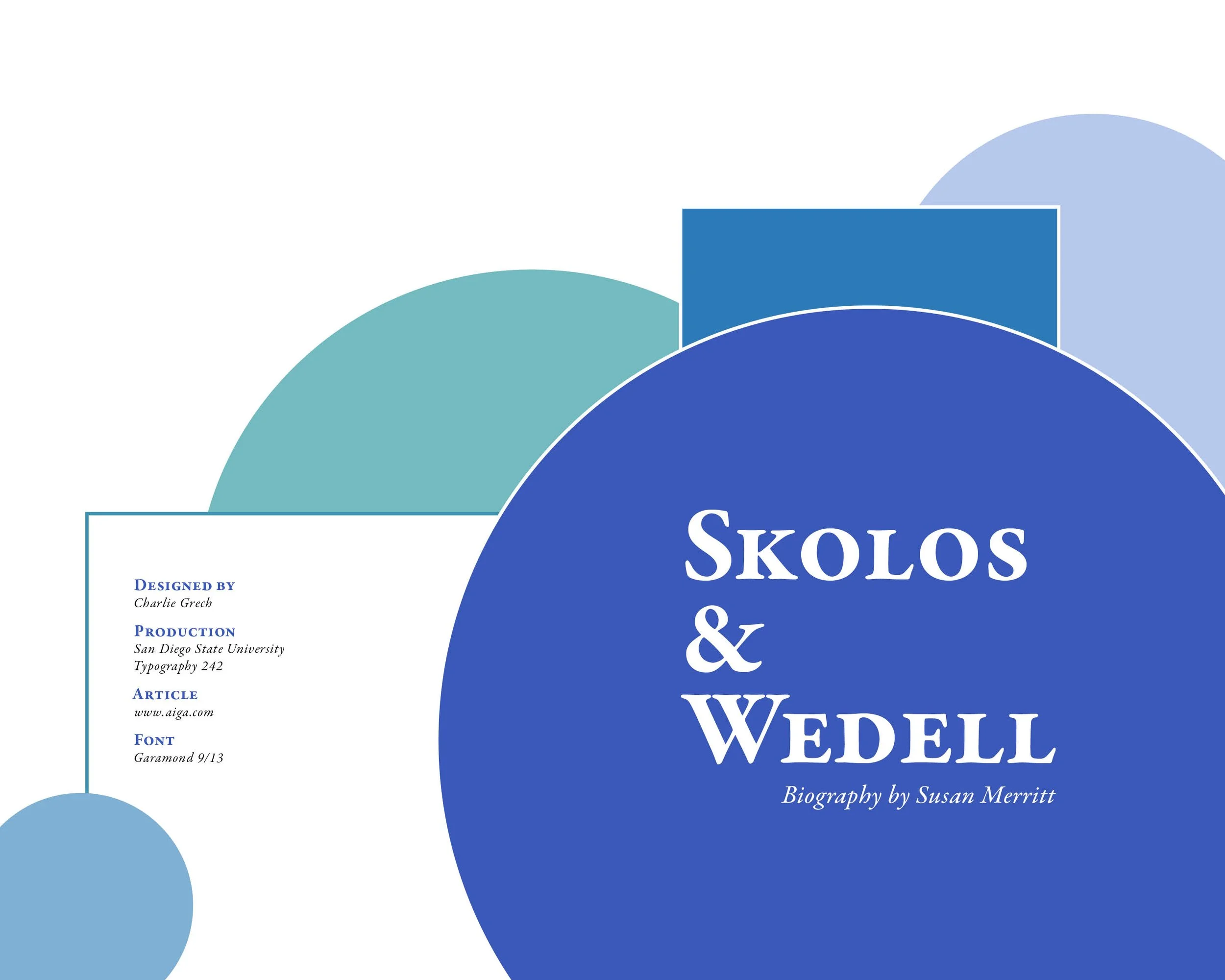
FRONT + BACK COVERS
ARTICLE CONTENT

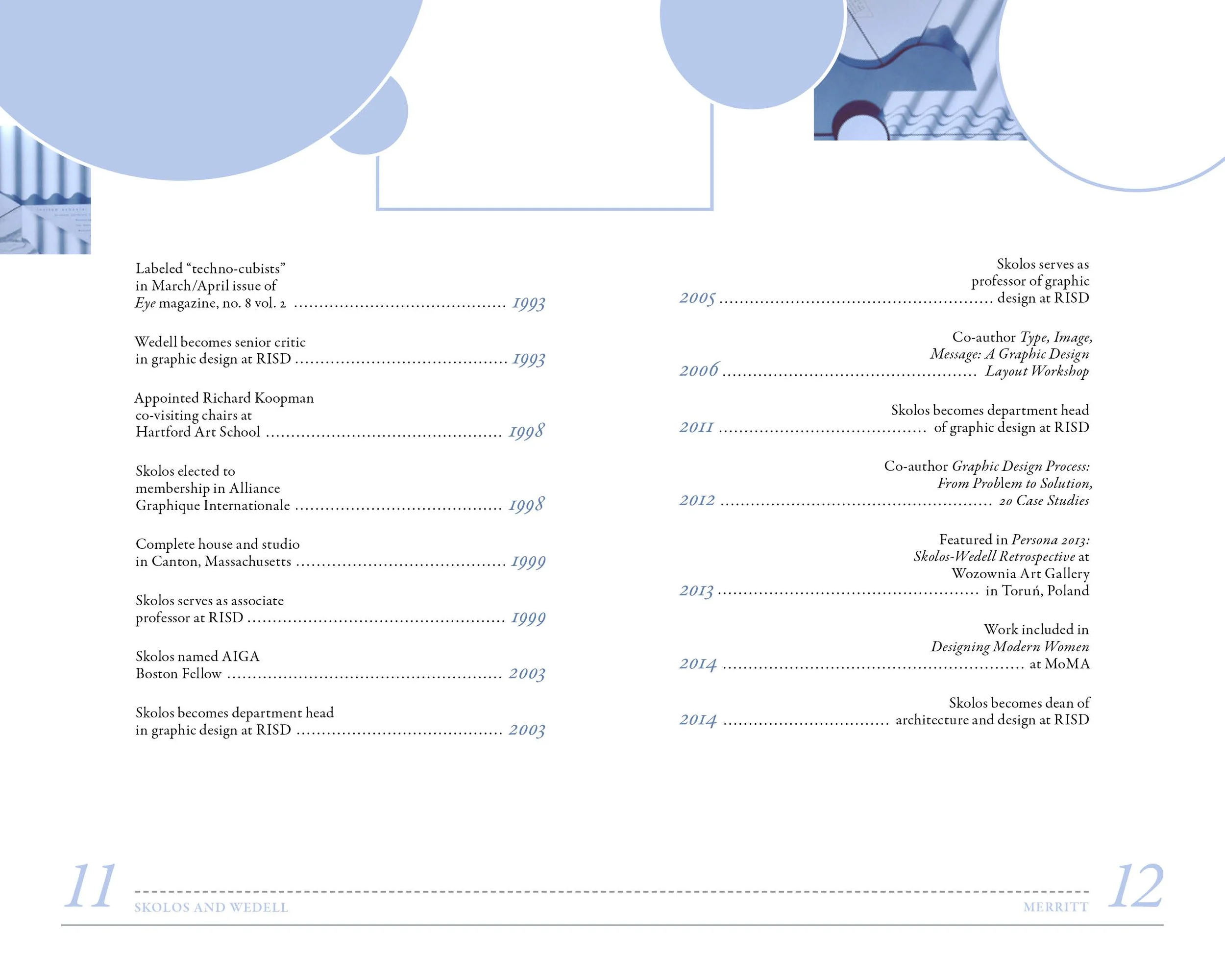
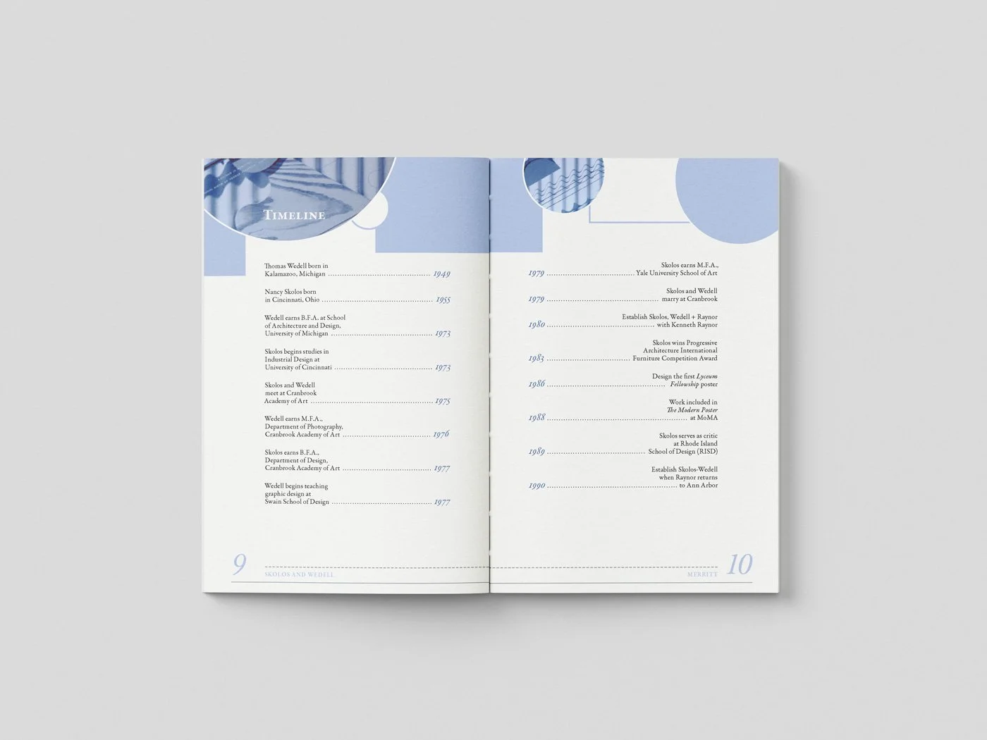
TIMELINE CONTENT
REVERSE TITLE PAGE
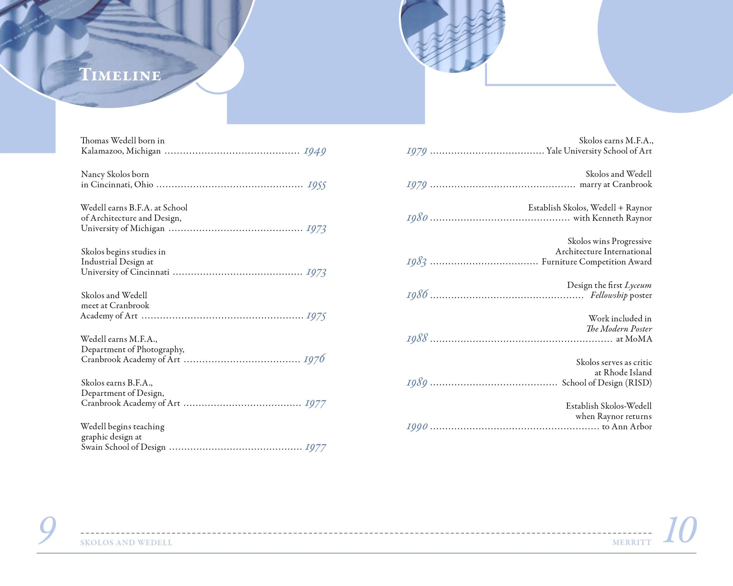
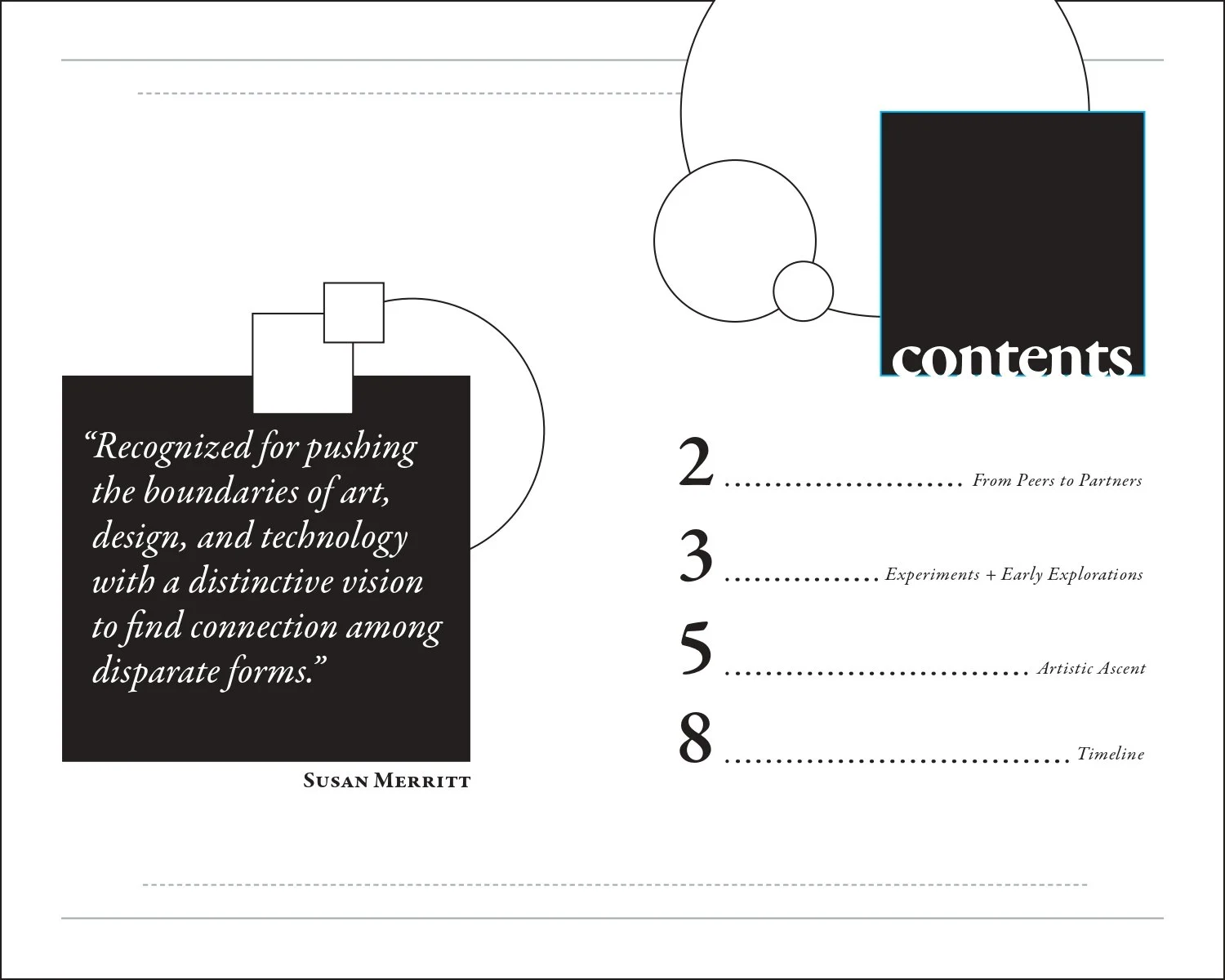
TABLE OF CONTENTS